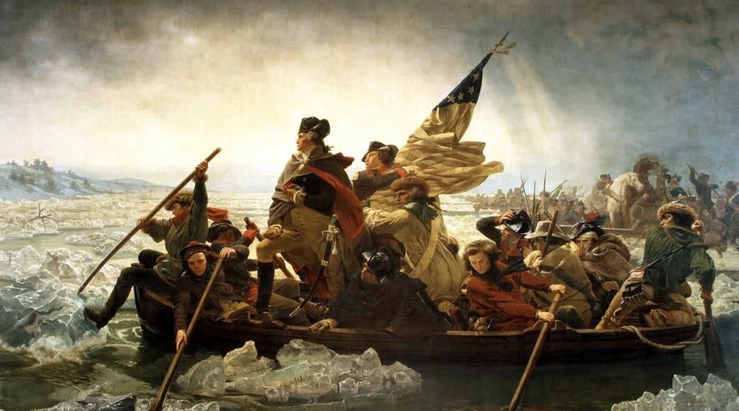
Army And Navy Dropped Their Uniforms For The Army Navy Game And As Always It Produced A Heated Debate

Just kidding - once again Army put forth a great effort and has an excellent uniform while navy missed the mark for a record 10th year in a row.
I promise you I will be objective on this discussion. As someone with style and taste who bleeds college football, I will approach this in a fair manner because I've seen this debate play out up close and personal for 10 years now so I am appointing myself as the authority on the matter. (Author's note: if you are a navy fan and find yourself growing increasingly angry with my takes, I suggest you start a military/Veteran brand, run it for 10 years, and get hired by Barstool. From there, your voice can be heard! Until then, it looks like my opinion shall be the one in writing. Thank you!)
As I was thinking about the uniforms, I tried to come up with criteria to judge who came up with the better iteration. Here is what I landed on that could be applied to any uniform:
- Media factor - if I am flipping channels/scrolling, does this uniform grab my attention and make me think, "oh, that's cool."
- Creativeness - is it unique without being weird.
- Complementary colors - not every color combo works
- History - is the uniform telling a story and is it a good one
With that, let's evaluate
Army
Media factor
Although a personal preference of mine, I think most people would agree that an all-white uniform is pleasing to the eye. The marbling plays into the next category but it's subtle so it doesn't distract from the uniform overall. The silver helmets allow for a slight contrast to the all white but coincide nicely with the entire fit. Grade: A+
Creativeness
In the year of our Lord twenty twenty five, good luck doing something with a football uniform that hasn't been done to death already. Which is why the use of the "Constitution" font is such a nice choice. The "Service" and "Sacrifice" on the facemask along with the raised "1775" on the back really pop with this style. The marbling is not something we've seen much of before but it's not overwhelming so it's a respectful nod to the headstones of Arlington Cemetery. The purple outline of the numbers as an homage to the Purple Heart is even more subtle than the marbling in a "blink and you'll miss it" fashion but I like that because if the outline was bold it would look too busy. Grade: A+
Complementary Colors
White. Silver. Black. Purple. Nothing else needs to be said because it works. All white has never missed. Grade: A+
History
Telling the story of the Army's 250 years of service and sacrifice is an honor that Army does not take lightly. We proudly represent the men and women, past and present, who have donned the Army uniform in service of this great country. Grade: A+
Overall grade: A+
Nice job, Army.
Navy
(I can't input Navy's tweet with their uniforms because they blocked me so you're going to have to search that out for yourself. I'm sorry! Objectively, I wanted to include their account because I felt like that would be fair. They have made it impossible.)
Media Factor
Listen, the colors of navy and white work well together so at first glance I might think oh ok this is nice. However, then we get to the helmet and what is that? Copper? Brown? I saw someone describe it as akin to feces (although they did not use the scientific term). There are three or four other designs of different colors on the helmet with different colors so it's sort of distracting. It would grab my attention but in a negative way sort of like rule #6 of crashing weddings - Do not sit in the corner and sulk. It draws attention in a negative way. Draw attention to yourself, but on your own terms Grade: C
Creativeness
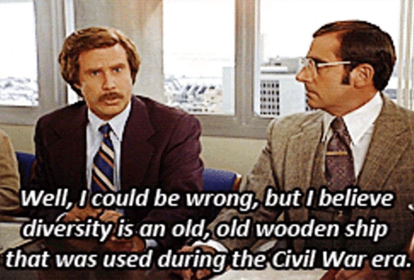
Using ropes from a ship to serve as the sleeve trim is certainly different and I appreciate the nod to their old ships, like Diversity, that used ropes instead of chains.
As for the helmets
Someone at Under Armor has a love affair with the airbrushed t-shirts they got at spring break in Daytona beach in 1992 and won't let it go. It truly looks like the uniform team is working on a group project but whomever is in charge of the helmets is in another room not talking to anyone. It is trying so so hard and it is completely missing the mark. It's too late now but if they had just done white helmets with this logo, it would have given navy their best uniform to date
Instead they have a Saturday morning cartoon comic strip going on with the helmets and despite what navy people tell you, deep down in places they don't talk about at parties, they do not like the helmets. They say they do to save face but no one with a modicum of taste actually thinks the helmets look good. They tried so hard to be unique that now it's weird. Also, they get points off for copying someone else's homework, which I'm pretty sure is frowned upon at navy.
They copied their buddy's homework and tried to change a few things so they didn't get caught but to no avail.
Grade: F Minus
Complementary Colors
How hard is it screw up red, white, and blue?! They have a cheat code. They have our Nation's colors to work with and someone decided to throw a turd in the punchbowl with those helmets. Sheesh. They get most of the credit here because I will never disparage our flag, but if they just did white helmets this would be a perfect score. Grade: B
History
I appreciate that they honored 250 years of our Navy's service to this country. I fully understand that the Marines are part of the Navy and that a lot of the players will commission to that branch, but are they obligated to have the Eagle, Globe, and Anchor on every uniform? Why couldn't the Navy have its shine by itself? In addition, I am told that navy's athletic department and alumni association purposely does not honor specific units in the Navy's history because they don't think it's their right to do so. Ok at least that's a reason but not one I understand. Every year that Army has honored a specific unit's history, those who served in that unit are over the moon about seeing their patch represented on such a grand stage. Weird stance by navy. Grade: A
Overall grade: C+
There you have it folks. Objectively, according to my scientific grading system and criteria, Army's uniforms outshine navy's again.
See you all in Baltimore on December 13th!