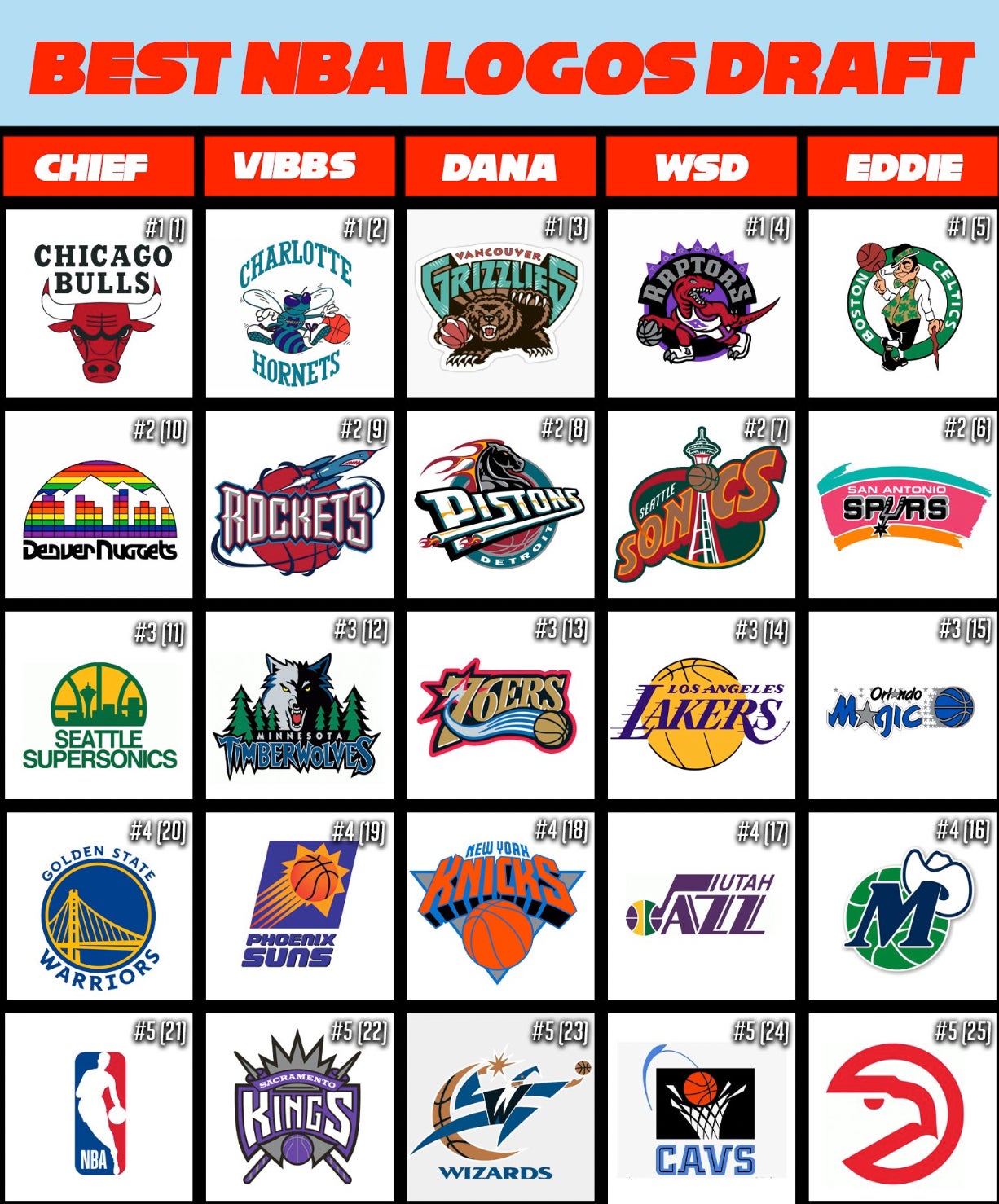
Ranking The NBA Logo Draft From Worst To Best

 Does the NBA have the worst team logos of the big 4 sports? During the full episode of The Dog Walk we quickly debated what league has the worst logos, and the knee jerk consensus among the group drafting was the NBA. After looking at the logos over time from every league, the NBA is NOT the worst. For me, it's the NFL by a mile.
1. MLB
2. NHL
3. NBA
*big gap*
4. NFL
The NFL logos are too simple - I get bored looking at them. As a Colts fan, I think the horseshoe is lame, but people seem to love the classic look. I understand corporations want a timeless, sleek, simple logo that people will remember, but for a sports team, I love a big, busy logo. Maybe that's why I love and picked a lot of 90's NBA logos for this draft.
I tried to take all bias out of my picks. Meaning you've got to judge the logo on pure design, and not because players that played for the team made the logo meaningful. The Lakers logo is an example of an iconic logo with a shit design. The Laker's logo is ass, and would be forgettable if it wasn't for the program's winning history and laundry list of legendary players. This is my breakdown of the picks, ranking everyone from worst to best ...
5. Chief: The Bulls logo got drafted way too high. I understand you've got two other Chicagoans chomping at the bit to get their hands on the timeless logo that has never changed, but my big board had the Bull's logo with 3rd round value. Definitely a cool logo, but I feel like having The GOAT win your franchise 6 championships is what makes the logo iconic. On the other hand, LeBron didn't make the Cavs logo cool, but he also didn't make them a dynasty. The fact that the logo can be flipped an looks like a robot fighting a crab definitely adds a layer of mystique to this classic logo.
The 80's Nuggets logo is almost so bad, it's good. I hate to say this during Pride Month, but I don't like the rainbow on the jerseys. Too many colors going on, so I personally don't like the logo, but I will say a Dikembe Mutombo Nuggets jersey is a top jersey.
I just found out the Seattle Sonics are named after Boeing, so slandering this logo may lead to me being framed for unaliving myself. Luckily, I think this is Chief's best pick in terms of value. The design is a little boring, but the colors make it work.
I don't hate the GS Bridge logo, but I think this is a logo that has been made cooler by the fact it represents a basketball dynasty.
The final rounds are where you want to take a reach on a prospect and hope they pan out. Chief drafted the NBA logo, and got roasted for trying to be too cute with the pick. Literally the very next day, Jerry West died and stock in the NBA logo pick skyrocketed. A reach, but I think this pick worked for Chief.
4. White Sox Dave: The safest #1 overall pick in the draft is the purple Toronto logo with the Raptor. It's a great logo, granted having two of the coolest basketball players in Vince Carter and TMac wearing the logo helps boost the "it factor", but even as a stand alone logo, who doesn't like Dinosaurs?
After the #1 pick, Dave lost me a bit with the Super Sonics. I think the color scheme is so bad it's good, but the space needle is a little boring. Then, I completely fell off the WSD wagon with the Lakers pick. The Los Angeles logo should have gone undrafted. Purple and Yellow are solid colors, but the logo is a snooze fest.
The original Jazz logo is one of the minimalistic NBA logos that works great, and it has an awesome color scheme. I even like the 90's Jazz logo with the mountains. Claiming Jazz and the mountains of Utah makes zero since, but it's a strong logo that somehow works. Z is the coolest letter in the alphabet. So what's better than one Z? Two Z's. I hope the Jazz never change their name, despite now being in Utah.
The old Cavs logo stinks. It looks like a logo they'd slap on a Pop-A-Shot at an arcade. No harm no foul drafting this in the 5th round, but Dave could have found some better value elsewhere.
3. Eddie: All of Eddie's picks are solid. No bad picks, expect for the Hawk's Pacman with the 5th round pick. His best value pick comes with the old school Mavs in the 4th round, and all the other picks were somewhere on my list. Every time I see the retro Spurs logo all I can think about is the classic Barstool "Darty" shirt.
2. Dana: Dana's first two picks are perfect. The Grizzlies logo didn't have any players that made it great, it was all the great color scheme and design on its own. Charolette Hornets / Vancouver Grizzlies were at the top of my draft list, and you could argue Dana got the best selection with the 3rd overall pick. After his first two picks, Dana lost me. The 76'ers logo stinks. The all black jerseys were cool, but this is strictly based the logos. and the logo is ugly. If AI didn't play for the 76'ers, this era would stink for Philly. Everything about the Knicks stink. Logo, mascot, fanbase. Hard pass on the New York Knickerbockers. You could argue the wizard's logo is so bad, it's good, and it's definitely better than what they have going on now. BUT, like the 76'ers logo, there is something about the copper/gold color that doesn't work in the logo.
1. Vibbs: If it were up to me, I'd pick myself to win everything. If you think the President of the United States doesn't go into the polling booth and vote for himself, you're crazy. BUT, I do honestly think I had the best top to bottom draft of anyone. I wanted to draft the Grizzlies with my first pick, but I was worried the Hornets logo wouldn't come back to me, and I had to have the Hornets. The 90's were built on Charolette Hornet's Starter Jackets.
I love the old Detroit Pistons logo, and I'd put it equal with the Rocket's logo, but the color scheme of the Rockets puts it over the Pistons.
The Timberwolves logo rules. The colors rock, the symmetry is great, the font is awesome, and wolves are a badass mascot.
The Phoenix Sun's logo is simple, but it works. Purple and Orange absolutely slap as a color scheme. I told the story in the episode, but I'll never forget when I was 6 years old and went with my mom to get a Phoenix Suns birthday cake for my 10 year old brother. When we got to the store, the old dude behind the counter kept insisting my mom shouldn't put purple on a cake for a boy, as my mom tried to explain Phoenix Suns team colors. So while there was a huge outrage in the 2010's over cake shops turning down gay people for cakes, just know my brother paved the way for gay rights in the 90's with his love for Charles Barkley.
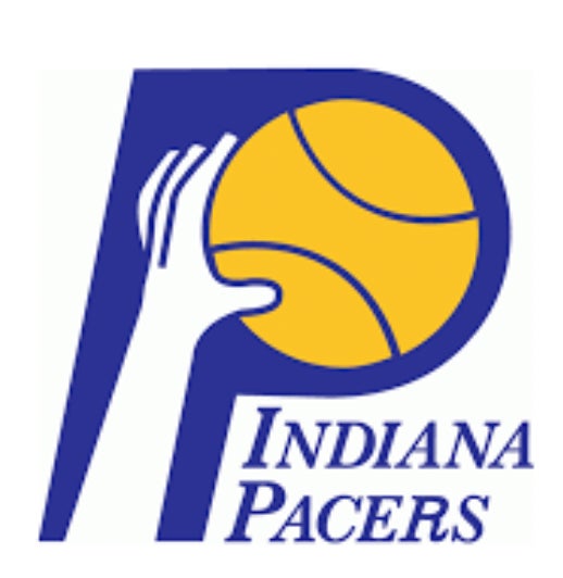
I thought about throwing out the Pacer's ABA logo with my 5th pick, but it kind of fits the same mold as the Suns logo, and I wanted some variety on the big board. Also, the Pacers P logo looks good, but the jerseys are way better than the logo alone. That's why I went with the Sacramento Kings. The crossed jousting lances with the crown are perfect, knights are badass as hell, and you can't go wrong with the silver and purple.
Random note: I wen't to renaissance fair with jousting and watched a knight going full speed on a horse, take a lance to the face. An ambulance showed up, and carted the guy off on a stretcher while still in full plate armor. I often wonder if that was part of the show, or even if that man is still alive.
This was a fun draft, and I hope The Dog Walk does the other big 4 sports. If they draft for MLB, give me the 90's Angels logo all day.