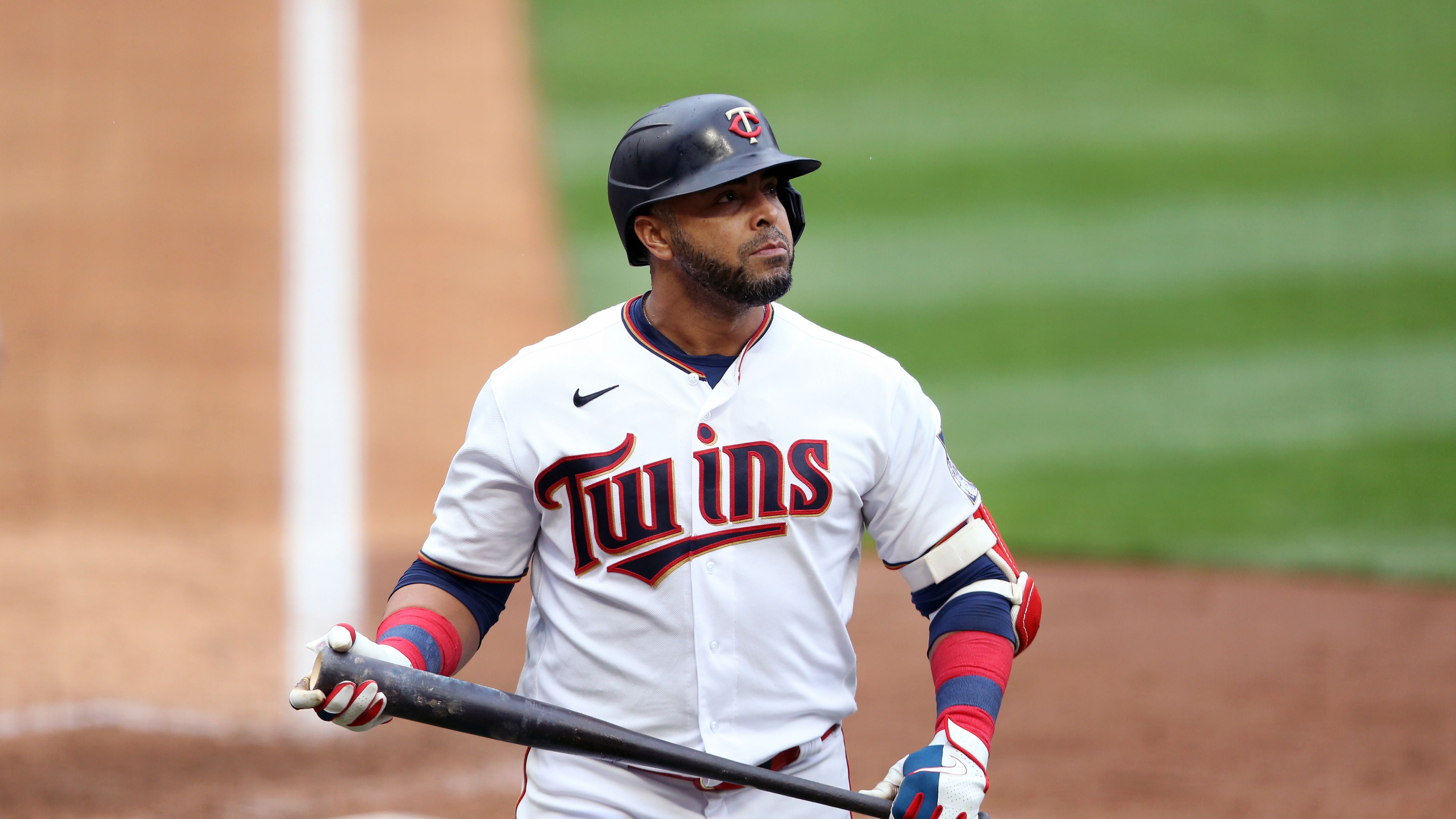
The Minnesota Twins Unveiled Their New Uniforms And What They Claim Is A New Logo


It's not a surprise that a team that hasn't won a playoff game since the Curse of the Bambino was still in play and has lost their last 18 (!!!) playoff games would want to change things up a bit. The Minnesota Twins today introduced a new logo and uniforms. Let's talk logo first.
Um, OK? I guess the new logo is slightly cleaner but this change seems pretty meaningless to me. The change feels like Vanilla Ice explaining the difference between the melody of Ice, Ice, Baby and Under Pressure
The uniform changes are much more interesting.
Here's the old home and road uniforms:
 Stacy Bengs. Shutterstock Images.
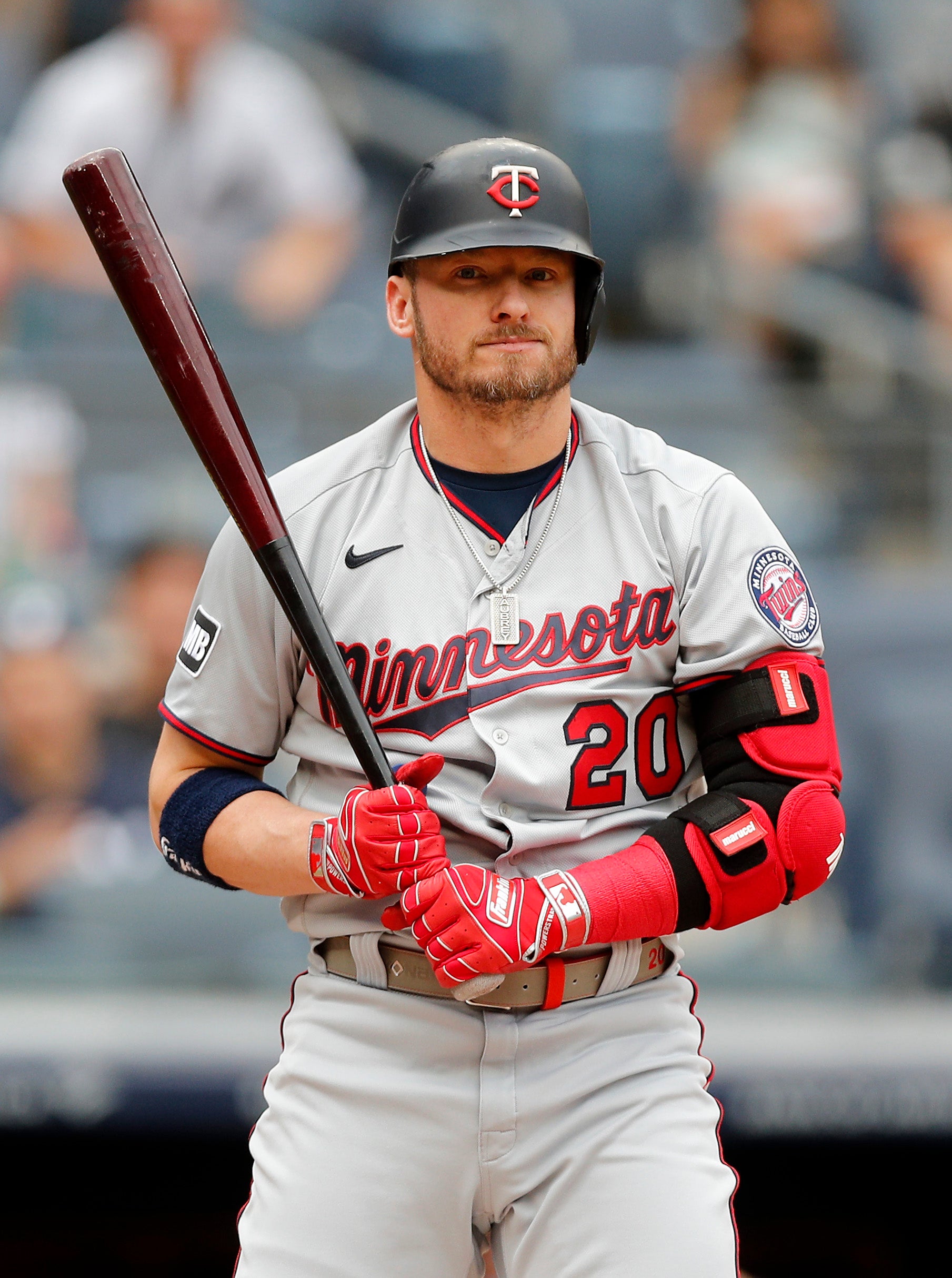 Jim McIsaac. Getty Images.
And here's what we will see in 2023:
I really like the home look. That's the biggest improvement to me. I love how clean "Twins" looks across the front of the jersey. The road uniform looks fine. I like that the grey is a darker shade and it contrasts nicely with the red numbers and belt. The alternative uniforms are boring and lousy. They could have been so great too. Why did they get rid of the powder blues? I thought it was a great throwback look and a perfect alternative uniform. They got rid of the below for that lame Twin Cities one that has as much excitement as a high school uniform from 1991?
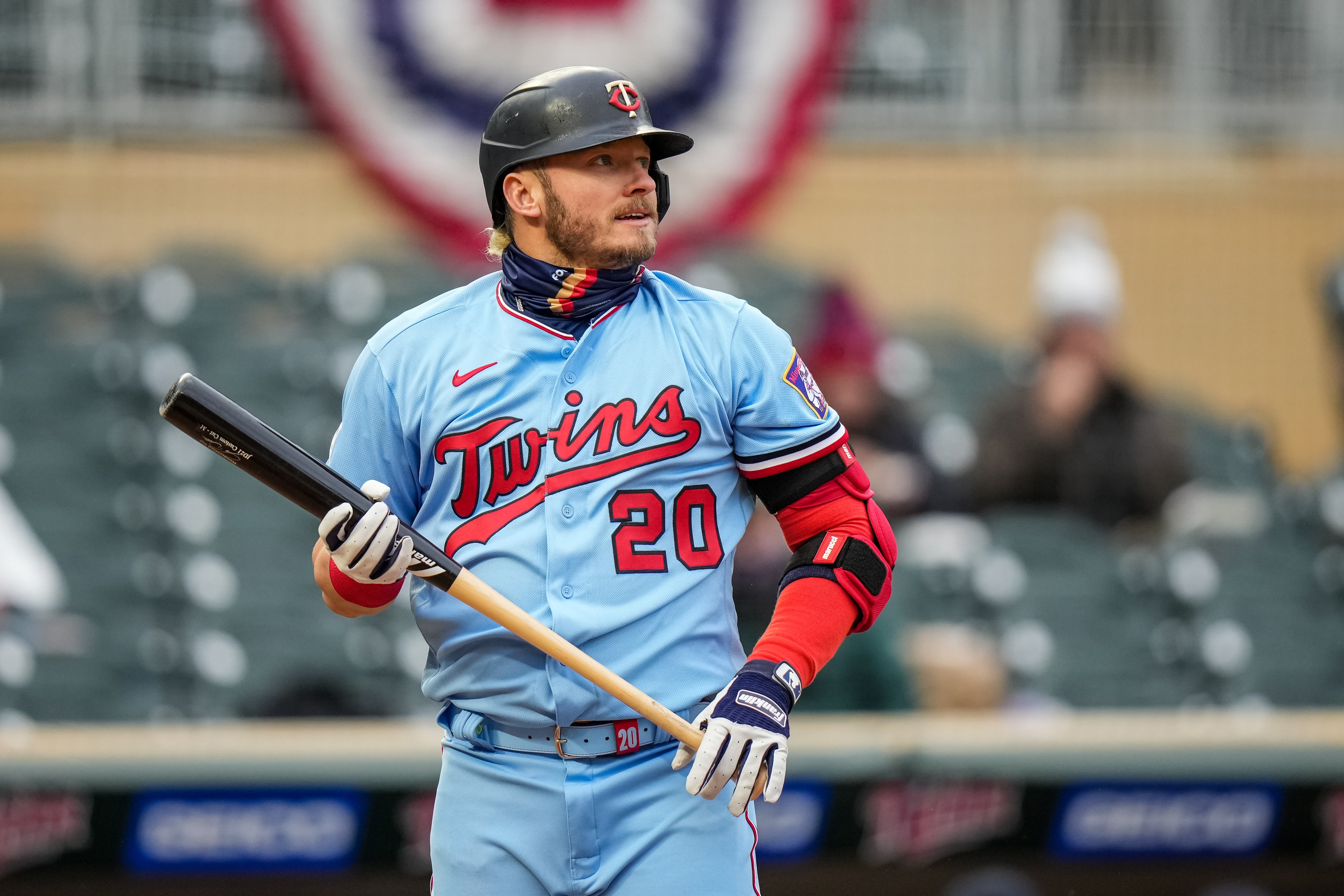 Brace Hemmelgarn. Getty Images.
I also don't love the road hats. It looks a little like the Marlins hats with the focus on the M and the north star does nothing for me.
All in all, I'm pretty underwhelmed. I liked when they made the uniform changes after the 2014 season that what they had been using. At that point, a refresh was past due. This didn't feel as necessary. The uniforms and look they had didn't feel stale and these changes don't feel different enough to justify the switch.
I give the primary uniforms a B-, the alternative ones a D and the whole package a straight C.