The Ugliest Baseball Cards

I was lucky enough to grow up in the late 80’s/early 90’s when baseball card collecting was at its peak. You had some of the greatest looking baseball cards ever during this time like the 1987 Topps design which might be the gold standard:
But for every great looking card from that time period, there are some absolutely hideous ones. Now, I’m not counting cards that weren’t mass produced. I remember there was a New England bread company called J.J. Nissen that had free baseball cards inside a loaf of bread. I’m not counting some Carlos Quintana card that you tried to avoid as you ate a sandwich. That’s not fair.
Here are the five ugliest baseball cards that you would have had to pay for:
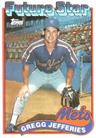
5.1989 Topps
It’s a set that people were excited about when it came out because of the Gregg Jefferies and Gary Sheffield rookie cards but the design is easily the ugliest Topps cards of the generation. Unusually lazy for Topps, this card only features the same bland cursive font for the team names.
4.1993 Upper Deck
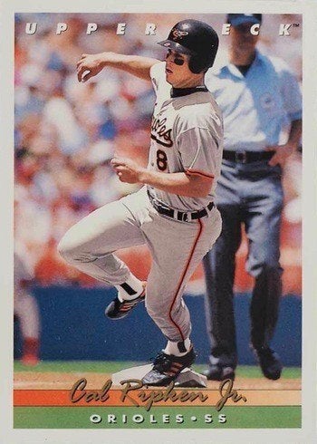
I’m probably unfairly grading Upper Deck on a curve but this card is not great. For years, Upper Deck had the highest quality cards on the market but this card looks very similar to something that Topps would have produced around the same time and it has the weird in-your-face Upper Deck branding on the top of the card. I don’t think I’ve ever seen a card company promote themselves more on their own card.
3. 1988 Fleer
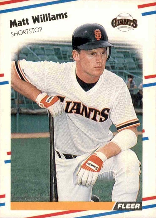
No one was ever excited to get Fleer cards. There were a few card companies around in the 80’s and 90’s and Fleer was the baseball card equivalent of a shrug.
This isn’t their worst card of this time period but it’s pretty terrible. The patriotic background clashes with not only the pictures on the cards but also the team color stripe at the bottom of the card. I also hate the off-kilter name and position as well.
2. 1990 Donruss
Donruss sucks. The worst part of Donruss cards is actually the back. For some reason, they only have the last 5 years of a player’s career on the back
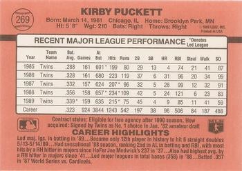
I used to love getting guys like Don Sutton or Chris Speier that had really long careers so I could read the back of the cards. I have no idea why Donruss wouldn’t want us to see the whole career but still had these weird career highlights.
But the 1990 card design is the worst that Donruss produced. All of it is lousy. The dark red background, the fake autograph for the name. I even hate the “edgy” spilled ink look in the middle background.
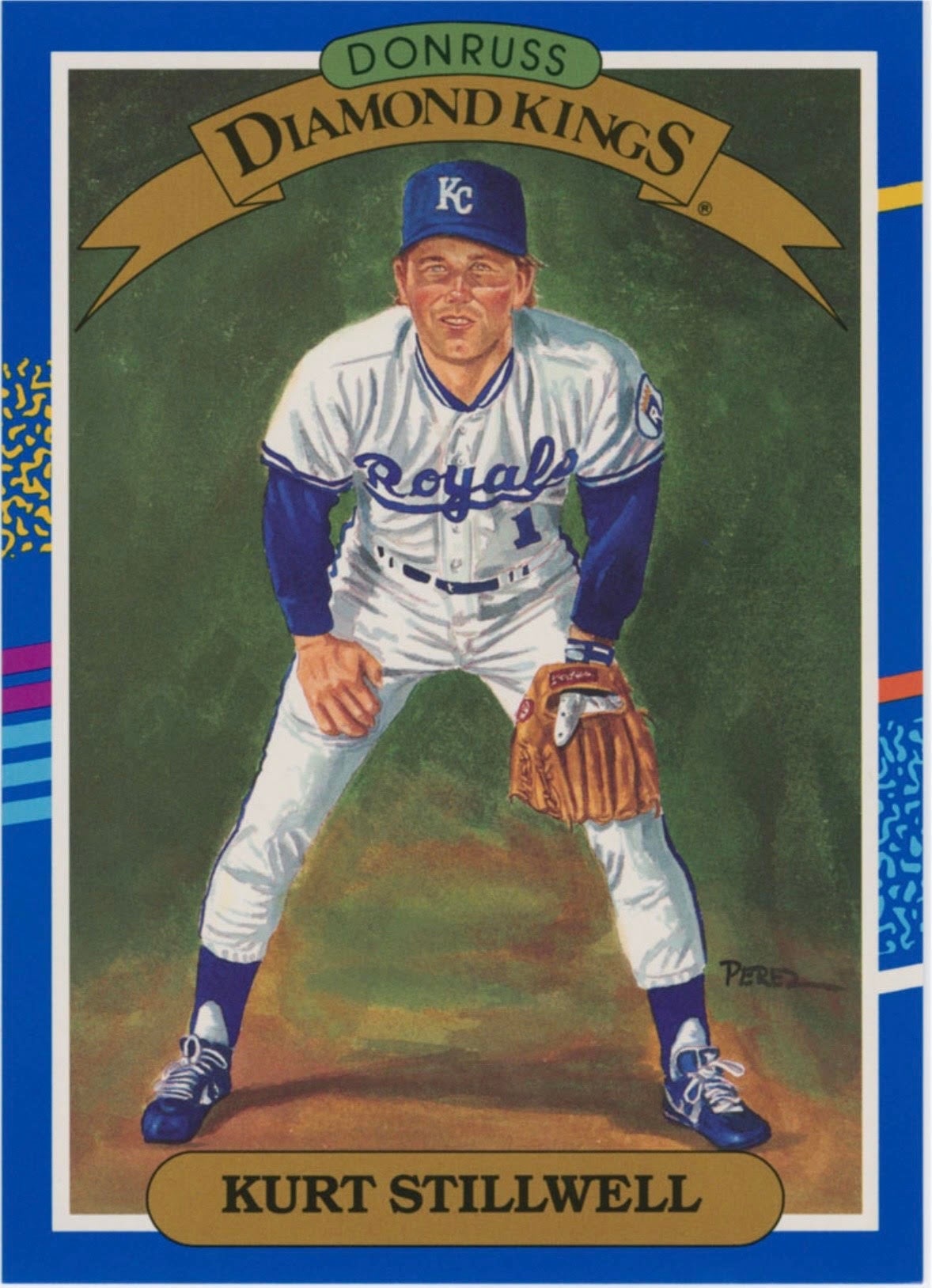
There is one thing I always loved about Donruss and it set them apart from another lousy card manufacturer like Fleer: the bizarre Diamond Kings set. This would be a Dick Perez painting of typically the best player from each team although Donruss also had a Team MVP series that was also in the set. For example, Kurt Stillwell was never even the 3rd best player on any team he played on yet he was a Diamond King despite his lackluster 1990 season. The Diamond King series was really unique and I always liked seeing them in a pack.
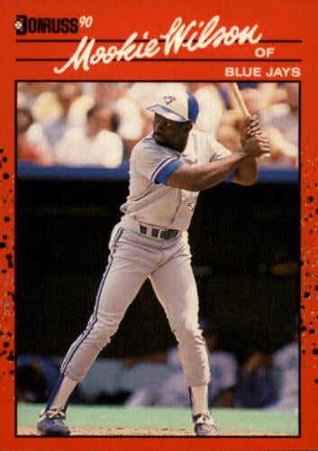
1.1991 Fleer
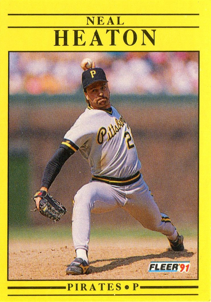
The worst. This card looks more like a road sign than a baseball card. Baseball cards are supposed to be fun. The 1991 Fleer design makes me question if the banality of life is worth it.
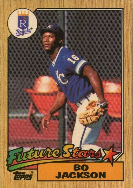
These are the worst cards that I grew up with but if there are lousy cards from when you were a kid, let me know. While any of these cards I mentioned made any collection less appealing, I’d be lying if I still didn’t get excited to see this guy in a pack.